ShopDreamUp AI ArtDreamUp

Deviation Actions


Suggested Deviants


![Thinking of you, wherever you are... [Blue]](https://images-wixmp-ed30a86b8c4ca887773594c2.wixmp.com/f/241480fd-6355-4cc8-b9e6-dc2478082b00/d5twku4-f416feac-f38f-484c-86ae-2790dec051b3.jpg/v1/crop/w_92,h_92,x_4,y_0,scl_0.079791847354727,q_70,strp/thinking_of_you__wherever_you_are_____blue__by_ceejayfrost_d5twku4-92s.jpg?token=eyJ0eXAiOiJKV1QiLCJhbGciOiJIUzI1NiJ9.eyJzdWIiOiJ1cm46YXBwOjdlMGQxODg5ODIyNjQzNzNhNWYwZDQxNWVhMGQyNmUwIiwiaXNzIjoidXJuOmFwcDo3ZTBkMTg4OTgyMjY0MzczYTVmMGQ0MTVlYTBkMjZlMCIsIm9iaiI6W1t7ImhlaWdodCI6Ijw9MTExMCIsInBhdGgiOiJcL2ZcLzI0MTQ4MGZkLTYzNTUtNGNjOC1iOWU2LWRjMjQ3ODA4MmIwMFwvZDV0d2t1NC1mNDE2ZmVhYy1mMzhmLTQ4NGMtODZhZS0yNzkwZGVjMDUxYjMuanBnIiwid2lkdGgiOiI8PTEyODAifV1dLCJhdWQiOlsidXJuOnNlcnZpY2U6aW1hZ2Uub3BlcmF0aW9ucyJdfQ.RdC0APSMBcQ4UaFcTVA_MYAFroEPVAiZHZHXlToi0yc)

![Thinking of you, wherever you are... [Colour]](https://images-wixmp-ed30a86b8c4ca887773594c2.wixmp.com/f/241480fd-6355-4cc8-b9e6-dc2478082b00/d5twlrn-3fd5d577-6135-487d-90ba-df79c3928e33.jpg/v1/crop/w_92,h_92,x_2,y_0,scl_0.071651090342679,q_70,strp/thinking_of_you__wherever_you_are_____colour__by_ceejayfrost_d5twlrn-92s.jpg?token=eyJ0eXAiOiJKV1QiLCJhbGciOiJIUzI1NiJ9.eyJzdWIiOiJ1cm46YXBwOjdlMGQxODg5ODIyNjQzNzNhNWYwZDQxNWVhMGQyNmUwIiwiaXNzIjoidXJuOmFwcDo3ZTBkMTg4OTgyMjY0MzczYTVmMGQ0MTVlYTBkMjZlMCIsIm9iaiI6W1t7ImhlaWdodCI6Ijw9MTE3MCIsInBhdGgiOiJcL2ZcLzI0MTQ4MGZkLTYzNTUtNGNjOC1iOWU2LWRjMjQ3ODA4MmIwMFwvZDV0d2xybi0zZmQ1ZDU3Ny02MTM1LTQ4N2QtOTBiYS1kZjc5YzM5MjhlMzMuanBnIiwid2lkdGgiOiI8PTEyODAifV1dLCJhdWQiOlsidXJuOnNlcnZpY2U6aW1hZ2Uub3BlcmF0aW9ucyJdfQ.0CvQcgm9oG3sfyQJilssmVBWftUE5NKeGNyfuLer1cY)
Suggested Collections


![[Roxas] Two Become One X-blade](https://images-wixmp-ed30a86b8c4ca887773594c2.wixmp.com/f/c4805c0b-1e71-4572-8815-dbaa6884558e/d6hm34u-6c140816-39df-416f-bee7-449bd7e5d3aa.png/v1/crop/w_184,h_184,x_2,y_0,scl_0.28930817610063/_roxas__two_become_one_x_blade_by_ariquaxiii_d6hm34u-92s-2x.png?token=eyJ0eXAiOiJKV1QiLCJhbGciOiJIUzI1NiJ9.eyJzdWIiOiJ1cm46YXBwOjdlMGQxODg5ODIyNjQzNzNhNWYwZDQxNWVhMGQyNmUwIiwiaXNzIjoidXJuOmFwcDo3ZTBkMTg4OTgyMjY0MzczYTVmMGQ0MTVlYTBkMjZlMCIsIm9iaiI6W1t7InBhdGgiOiJcL2ZcL2M0ODA1YzBiLTFlNzEtNDU3Mi04ODE1LWRiYWE2ODg0NTU4ZVwvZDZobTM0dS02YzE0MDgxNi0zOWRmLTQxNmYtYmVlNy00NDliZDdlNWQzYWEucG5nIiwiaGVpZ2h0IjoiPD01NzMiLCJ3aWR0aCI6Ijw9NjAwIn1dXSwiYXVkIjpbInVybjpzZXJ2aWNlOmltYWdlLndhdGVybWFyayJdLCJ3bWsiOnsicGF0aCI6Ilwvd21cL2M0ODA1YzBiLTFlNzEtNDU3Mi04ODE1LWRiYWE2ODg0NTU4ZVwvYXJpcXVheGlpaS00LnBuZyIsIm9wYWNpdHkiOjk1LCJwcm9wb3J0aW9ucyI6MC40NSwiZ3Jhdml0eSI6ImNlbnRlciJ9fQ.AGaGft-Bb0dT_RKlYwMYWN3VJbSkTTOh4OD56B9VrH8)
![[Roxas] Two Become One X-blade](https://images-wixmp-ed30a86b8c4ca887773594c2.wixmp.com/f/c4805c0b-1e71-4572-8815-dbaa6884558e/d6hm34u-6c140816-39df-416f-bee7-449bd7e5d3aa.png/v1/crop/w_92,h_92,x_1,y_0,scl_0.14465408805031/_roxas__two_become_one_x_blade_by_ariquaxiii_d6hm34u-92s.png?token=eyJ0eXAiOiJKV1QiLCJhbGciOiJIUzI1NiJ9.eyJzdWIiOiJ1cm46YXBwOjdlMGQxODg5ODIyNjQzNzNhNWYwZDQxNWVhMGQyNmUwIiwiaXNzIjoidXJuOmFwcDo3ZTBkMTg4OTgyMjY0MzczYTVmMGQ0MTVlYTBkMjZlMCIsIm9iaiI6W1t7InBhdGgiOiJcL2ZcL2M0ODA1YzBiLTFlNzEtNDU3Mi04ODE1LWRiYWE2ODg0NTU4ZVwvZDZobTM0dS02YzE0MDgxNi0zOWRmLTQxNmYtYmVlNy00NDliZDdlNWQzYWEucG5nIiwiaGVpZ2h0IjoiPD01NzMiLCJ3aWR0aCI6Ijw9NjAwIn1dXSwiYXVkIjpbInVybjpzZXJ2aWNlOmltYWdlLndhdGVybWFyayJdLCJ3bWsiOnsicGF0aCI6Ilwvd21cL2M0ODA1YzBiLTFlNzEtNDU3Mi04ODE1LWRiYWE2ODg0NTU4ZVwvYXJpcXVheGlpaS00LnBuZyIsIm9wYWNpdHkiOjk1LCJwcm9wb3J0aW9ucyI6MC40NSwiZ3Jhdml0eSI6ImNlbnRlciJ9fQ.AGaGft-Bb0dT_RKlYwMYWN3VJbSkTTOh4OD56B9VrH8)


You Might Like…


Featured in Groups


Description
A photoshop project for my DIMM class.
I actually drew a design similar to this multiple times, I never posted them though cause they were shit.
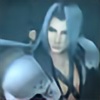
The design I drew was Cloud's wrapped buster sword and his wing beside it. Same with Sephiroth's Masamune.
So we had to make a poster or something (he called it a poster) and I came up with this.
I couldn't get an image of KH Sephiroth's sword alone so I have FF7's so deal.
The words were pieces of a song by Breaking Benjamin called Anthem of the Angels. It's one of my favorite songs by them and I dunno I thought of KH with it for some reason XD;
I was going for Cloud's darkness for the theme. I still think something happened to Zack in Kingdom Hearts so whatever happened made Cloud fall to darkness.
Cloud Strife, Sephiroth, Kingdom Hearts logo (c) Square Enix
Anthem of the Angels lyrics (c) Breaking Benjamin
Images found of Google not by me.
I actually drew a design similar to this multiple times, I never posted them though cause they were shit.
The design I drew was Cloud's wrapped buster sword and his wing beside it. Same with Sephiroth's Masamune.
So we had to make a poster or something (he called it a poster) and I came up with this.
I couldn't get an image of KH Sephiroth's sword alone so I have FF7's so deal.
The words were pieces of a song by Breaking Benjamin called Anthem of the Angels. It's one of my favorite songs by them and I dunno I thought of KH with it for some reason XD;
I was going for Cloud's darkness for the theme. I still think something happened to Zack in Kingdom Hearts so whatever happened made Cloud fall to darkness.
Cloud Strife, Sephiroth, Kingdom Hearts logo (c) Square Enix
Anthem of the Angels lyrics (c) Breaking Benjamin
Images found of Google not by me.
Image size
750x750px 143.28 KB
© 2011 - 2024 CursedCrusnik
Comments15
Join the community to add your comment. Already a deviant? Log In
pretty cool concept. I like the broken glass. it looks nice, I like how you did it.
I think the category for it is photo-manipulation ( you're technically not supposed to use images you don't have written permission for though ).
the only issue I see with it is the lyrics don't seem to have much rhyme or reason, they're just kinda stuck on there in random places. writing looks best if you pick out the most important/relevant parts and use different font sizes/styles ( though keeping to all one color like you did is a good idea ) and have them positioned in key places, usually to create a sense of balance or have more-important lines more noticeable, etc, like have the less-important extra lines be faded so they're transparent or darker/etc. "If you go then so will I" is the best-positioned one, it would probably work well if that was the only text you used. also, the dark blue is hard to read against black, esp with the bevel effect. I'd got for white outline or pick a lighter color, then use dark outline around that, it should be under "stroke" probably on your program, with a setting for how thick to make it.
that song reminds me of FF7, cuz someone dies in it, so it goes with either Zack or Aeris. only I think in the song it's someone dying slowly in a hospital, like from an illness, not suddenly like Zack/Aeris went. I put it on my Cloudy profile anyway cuz the tone when good with him.